With design, generally speaking, it’s usually a good thing to be different.
12/02/2018
Being aware of what’s hot and what’s not can be a great way to stay ahead of current web practices.
Emma PrenticeDesigner
Share article
With design, generally speaking, it’s usually a good thing to be different. However when it comes to web design there is simply no need to continuously reinvent the wheel. For example in UX design the unspoken rule is to stick to recognised UX patterns that are known to work well. Being aware of what’s hot and what’s not can be a great way to stay abreast of current web practices when designing something new. So without further ado here are some trends we’ve seen repeatedly crop up:
Trend 1 – blurring lines between digital and print
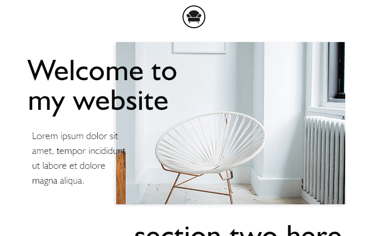
In print we’re used to seeing interesting, and experimental compositions in glossy magazines and brochures; this style is now being extended to the digital world. Many web grids are becoming ‘broken’, a lot more white or ‘resting’ space is at play, and images are working alongside typography – rather than these two elements being considered separately. A great example of this is the recently re-designed Zara website. This abstract design sees images layered upon one another, with overlaying text/typography creating a magazine look-book aesthetic.
Trend 2 – Less traditional hero panels
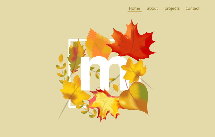
Instead of seeing a typical image with bog-standard logo / overlay text, hero panels are evolving with illustration, fun engaging videos and beautiful typography. Some designers are even opting to not having a big image at all, but are going minimalist with only type at the top. This option is a good way of drilling down on load times, and getting users to the main content quickly.
With adding more animation, there’s always got to be a balance. You cannot have so much going on that you can’t concentrate. Subtle use of animation throughout the page is a fantastic way to engage users than just hover states. Animation can even be used to subconsciously guide your users to the content that you want them to see. We love Storm London’s animation style, it matches their brand perfectly.
Additional ‘lazy-loading’ content which triggers as the user scrolls is an example of achieving subtle animation that will keep users interested especially on content rich sites like Aviva.
Trend 4 – Typography
As more fonts are becoming available to users on the web, bold and beautiful typography is something we are seeing more commonly in web design. Good typography makes a site really stand out and draws your eye to the text keeping the user engaged as Oliver Reichenstein states in his article“Web Design is 95% Typography”
Some lovely examples of typography done well are LPD’O and Vermont.
Trend 5 – Story lead web-pages
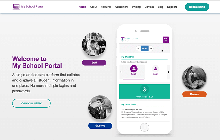
More often than not, designers have started giving a brand narrative as the user scrolls, combining clear thought-out sections, CTA’s, and copy that tell a story truly creates a user experience that makes a visit to the site more memorable.
Some fantastic examples of narrative led websites are brring and Visa Europe.
Want to find out how your website can be ‘trendy’? Contact us on 01474 704400 to find out more.
If you liked reading this article you may also like: