At the beginning of the year we decided that the company website needed a facelift.
15/05/2018
We are really proud of the new website and all the work that has gone into it.
Hannah Brown Project Manager
Share article
At the beginning of the year we decided that the company website needed a facelift. The old site was jam packed full of content, imagery and colour but we wanted to simplify this and thought a more minimalist route would do the trick.
The new mso website has been up and running for a couple of months now, here’s a quick overview of the changes we’ve made and why.
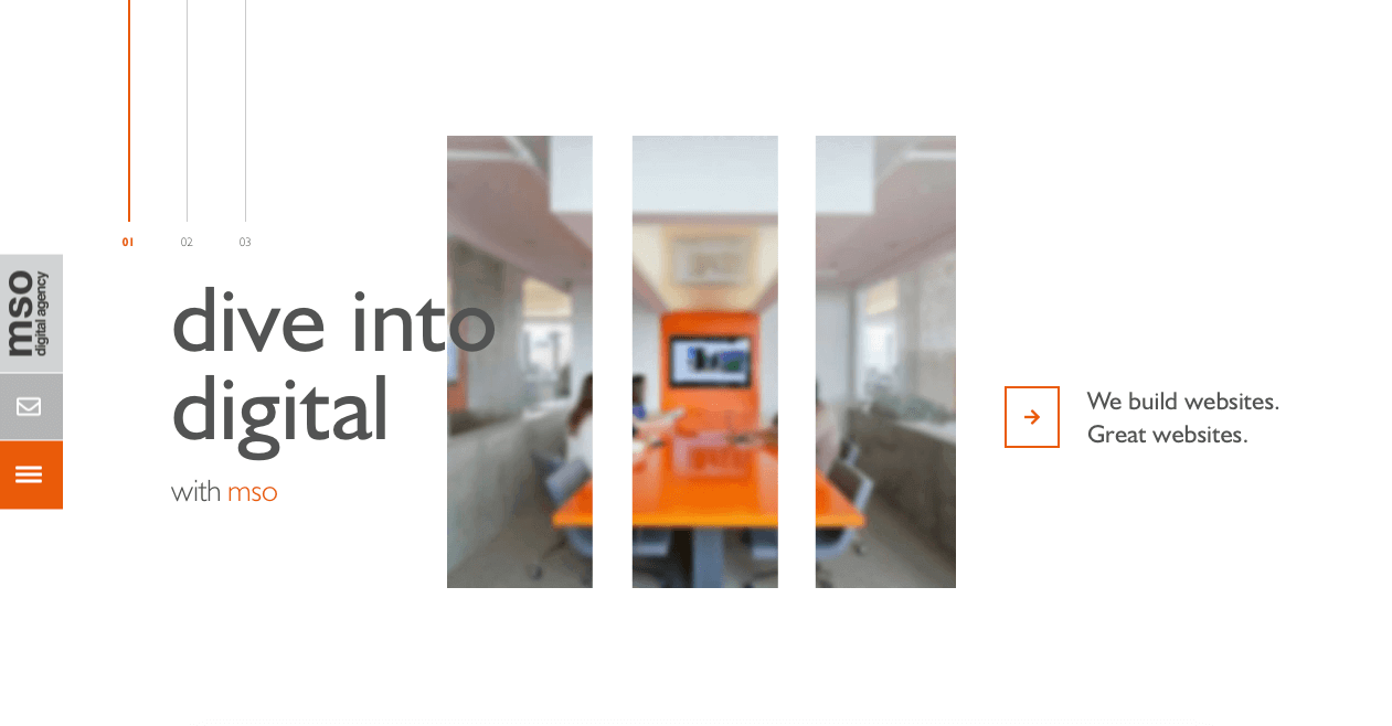
Starting with the homepage. Our old homepage was bright, colourful and full of images, we really wanted to keep things simple and concise with this new site. We have designed and created a minimalistic homepage with three simple sliders, these take you down to a client list component, then our footer. Using powerful imagery on the three homepage sliders was key to draw the users attention, each image is overlaid with a cut out of an abstract letter from ‘mso’. The three sliders introduce us at mso, as well as showing off two of our amazing clients. With subtle animation adding to the interest of the page we think this is a great introduction to the website.
For the navigation we have created a full page nav, making the site is as easy to navigate as possible ensuring everything is clear and simple. Using clean animation to encourage user engagement but not take away for the important information.
The content structure and amount was a big change for us, we stripped back the content on the site so that it wasn’t too overwhelming and the site was only full of relevant information that gets straight to the point, in keeping with the minimalist theme whilst still explaining our company and services.
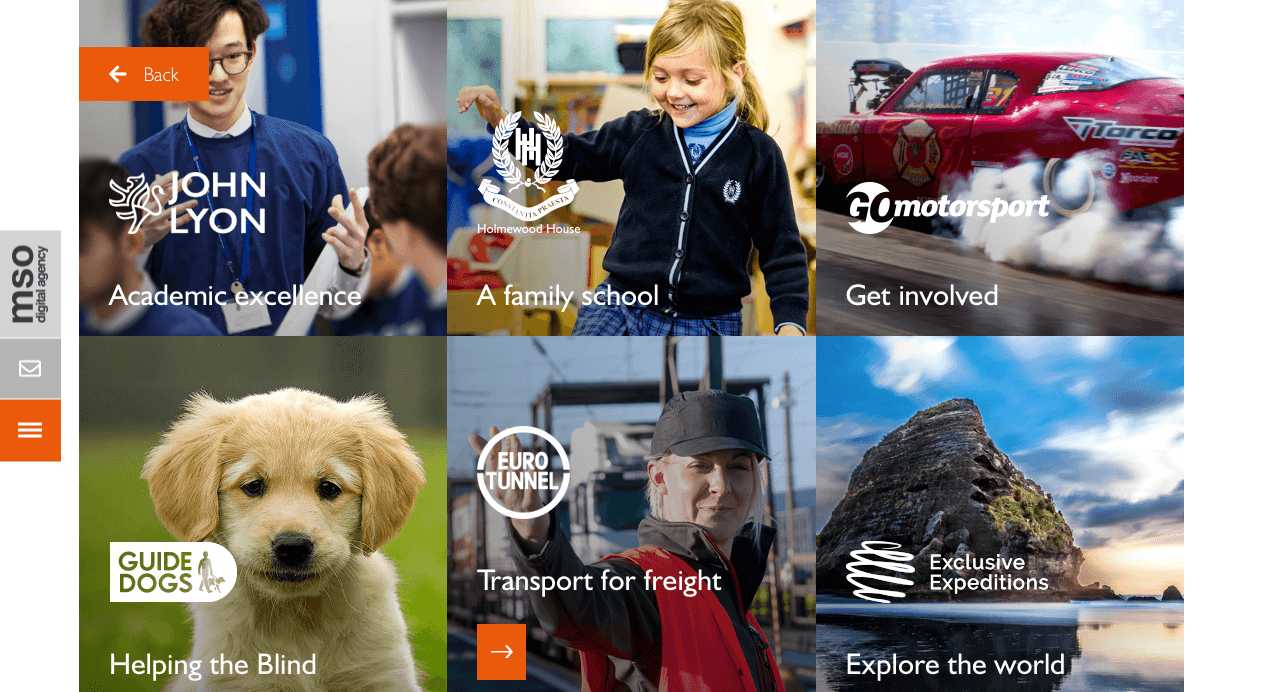
One section of the website that we are very proud of is the Our Work Section. This area collates our case studies and work that we have completed over recent years. This is made up of a tiled grid displaying our clients logos, that when clicked upon take the user to the main case study page. Each page is composed of sliding images in the clients branded colours, which contrast greatly to our brand of the minimal grey and orange throughout the rest of the site. These pages include a short summary of the work that’s been completed, also the services that were/are provided during the project and ongoing relationship.
There are so many positive changes completing the site update, I have only named a few! We are really proud of the new website and all the work that has gone into it. Please have a click around and let us know what you think!
If you liked reading this article you may also like: