Do you find that although you’ve got a logo, all of your company's marketing material looks different?
Creating a consistent brand
Do you find that although you’ve got a logo, all of your company’s marketing material looks completely different; the colour is never quite right, there are lots of different fonts in use, and the message that you are trying to convey seems a little… all over the place?
The brand savvy of us out there are able to nip these errors in the bud early on and think about the bigger picture. We are aware that a logo is likely to be used for both print and web application, and will often need to sit alongside other elements such as imagery, text and other colours – so we design with versatility.
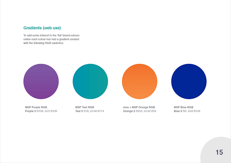
Our expertise means that we can provide your new logo in a variety of formats, for example; icon and wordmark only versions, full colour with rgb, cmyk and pantone (coated/uncoated) versions, plus black and white versions too. Although this may seem over the top it is actually necessary because all of these formats will have a different application purpose across your marketing medium. Many organisations choose to have these application purposes of the logo documented in a pdf or printed booklet, commonly known as Brand Guidelines
In short, brand guidelines are a set of standards that if followed are fundamental to creating a relationship between brand and customer by keeping branding materials consistent and more importantly easily recognisable. They ordinarily include a details of brand fonts and colours (with values for both print and web usage), examples of what not to do, along with examples of mocked-up marketing materials that comply with the guides set in the document. Keeping consistency across your brand requires commitment, but is truly detrimental to your success.
Here are three lovely examples produced by other companies
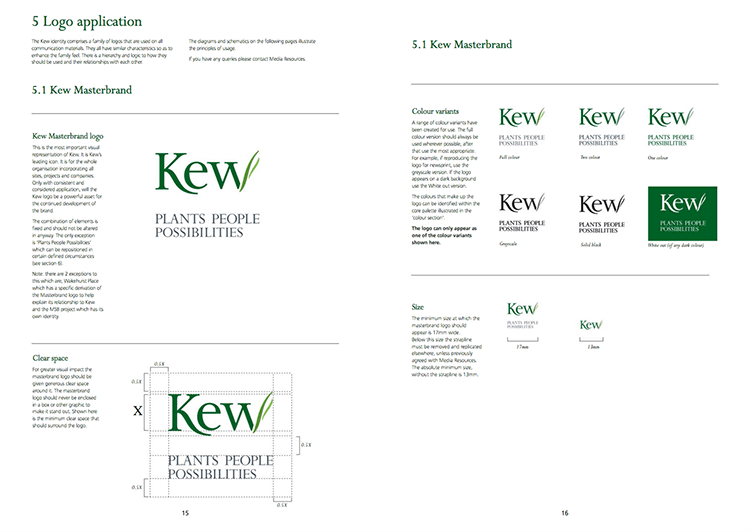
- Kew style guide
- Barbican Identity Guidelines Book Designed by North
- Macmillan Cancer Support – Brand identity guidelines
And finally below are some pages taken from our My School Portal brand guidelines document